character design
click to navigate to different sections
homebuddies
my final university project, the homebuddies, featured in the Leeds Arts University 2023 BA (Hons) Illustration Graduates Show, hang your art up!.
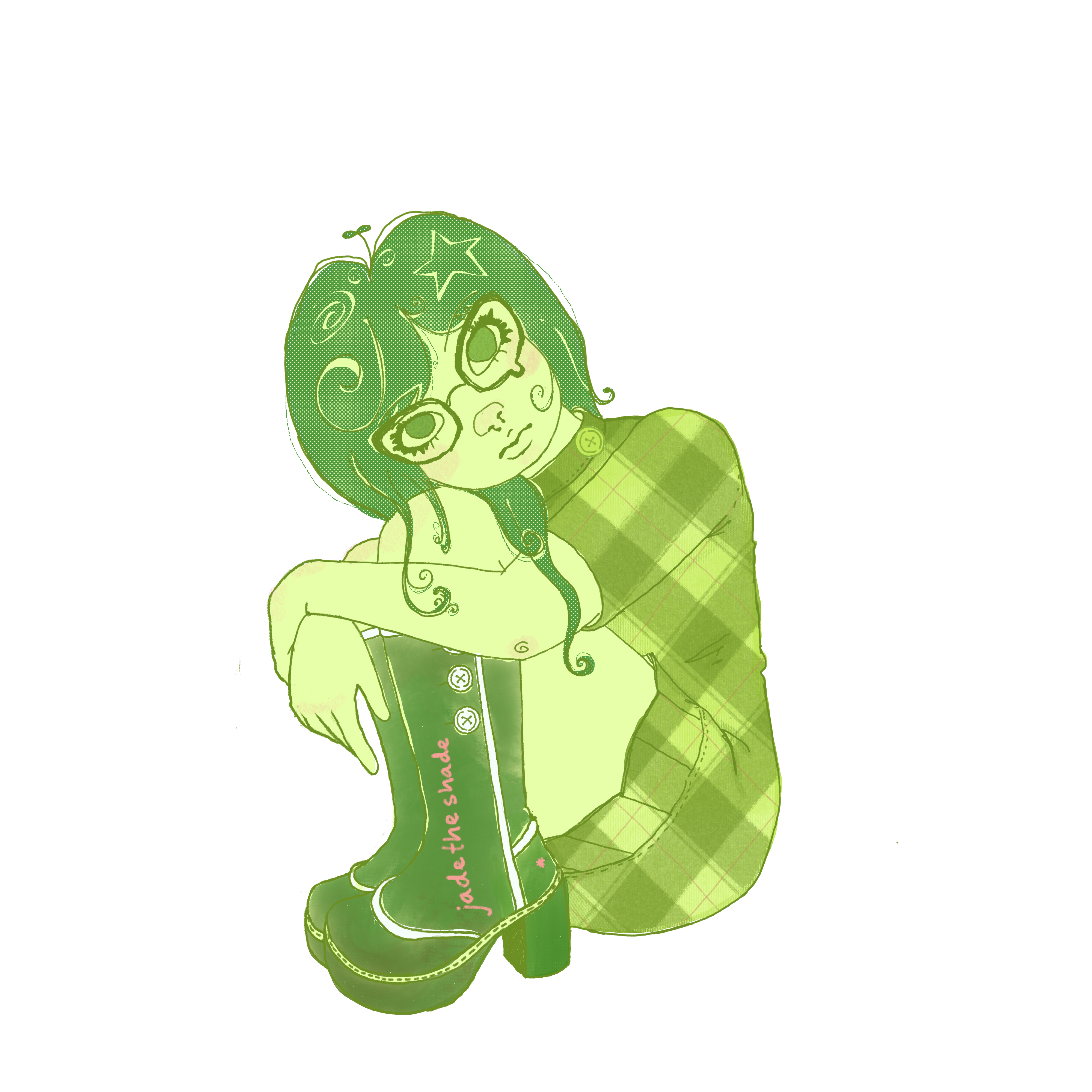
the homebuddies, is a character design series featuring mascot-style characters inspired by introvert personality types, using qualitative data from the 2011 study “Four Meanings of Introversion: Social, Thinking, Anxious and Restricted (STAR) Introversion” by Jennifer Grimes, Jonathan Cheek, and Julie Norem.
the idea of making mascots came through my exploration of character design, specifically with a focus on Japanese mascot culture. i learnt a lot about the various mascots and their symbolism and purpose in Japanese society through Idle Idol (2010) by Edward and John Harrison.
when you consider any mascots that come to mind, they are mostly loud, proud and expressive. wouldn't it be bizarre if there were introverted mascots? that's why i made the homebuddies, as it would be interesting to spin the narrative on the mascot's head, so to speak.
the homebuddies also 'hits home' for me as i am quite the introvert myself. showcasing representation for a body of people that are socially undermined, overshadowed, and talked-over was a driving factor of this project.
the homebuddies are here to be loud and proud...from a safe distance, of course.
meet the homebuddies
wip
homebuddy hats
wip
mascot exploration
explorative character designs i developed during my third year of university; inspired by Japanese mascot culture, Sanrio characters, and the works of japanese artist Yoshitomo Nara.
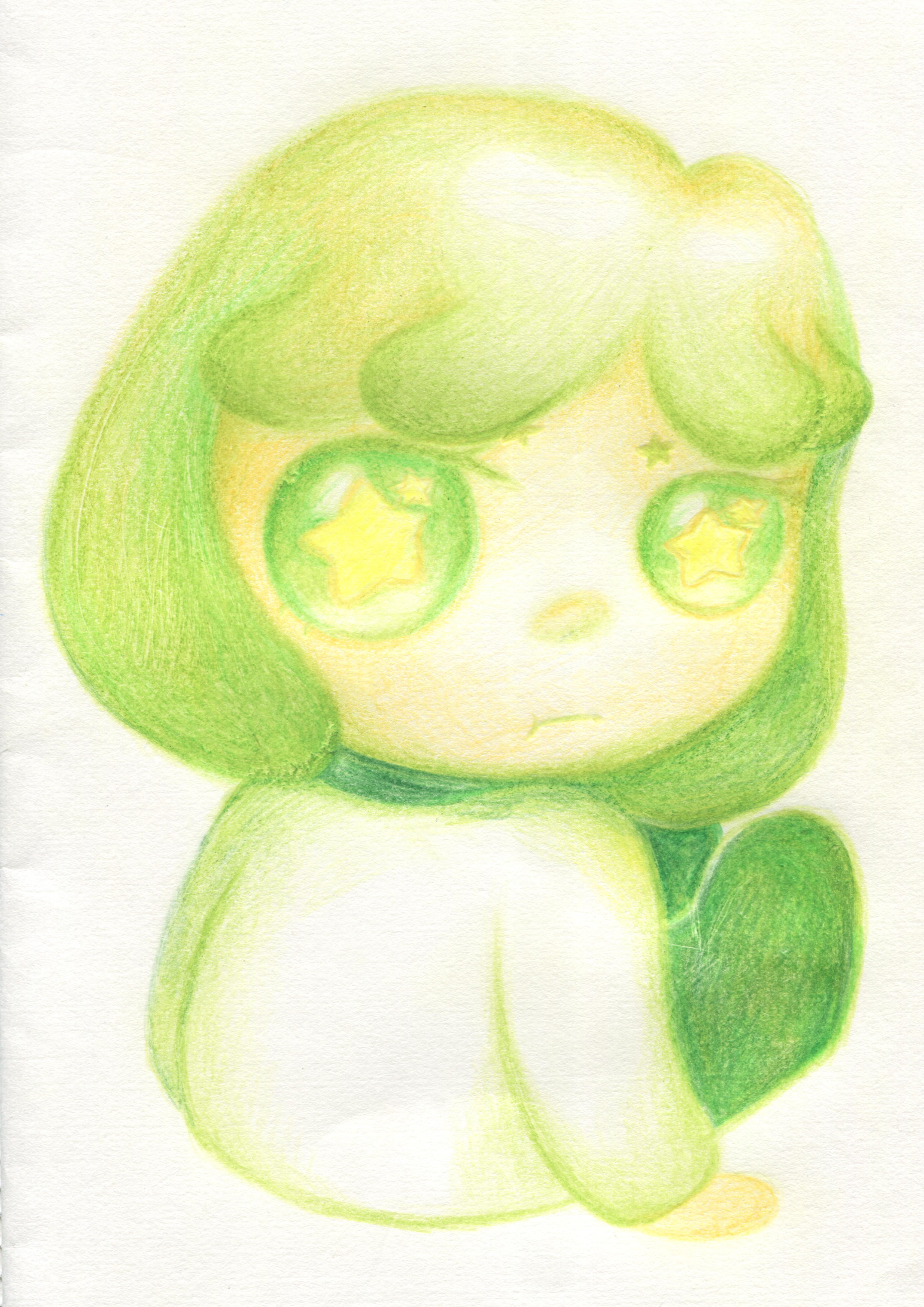
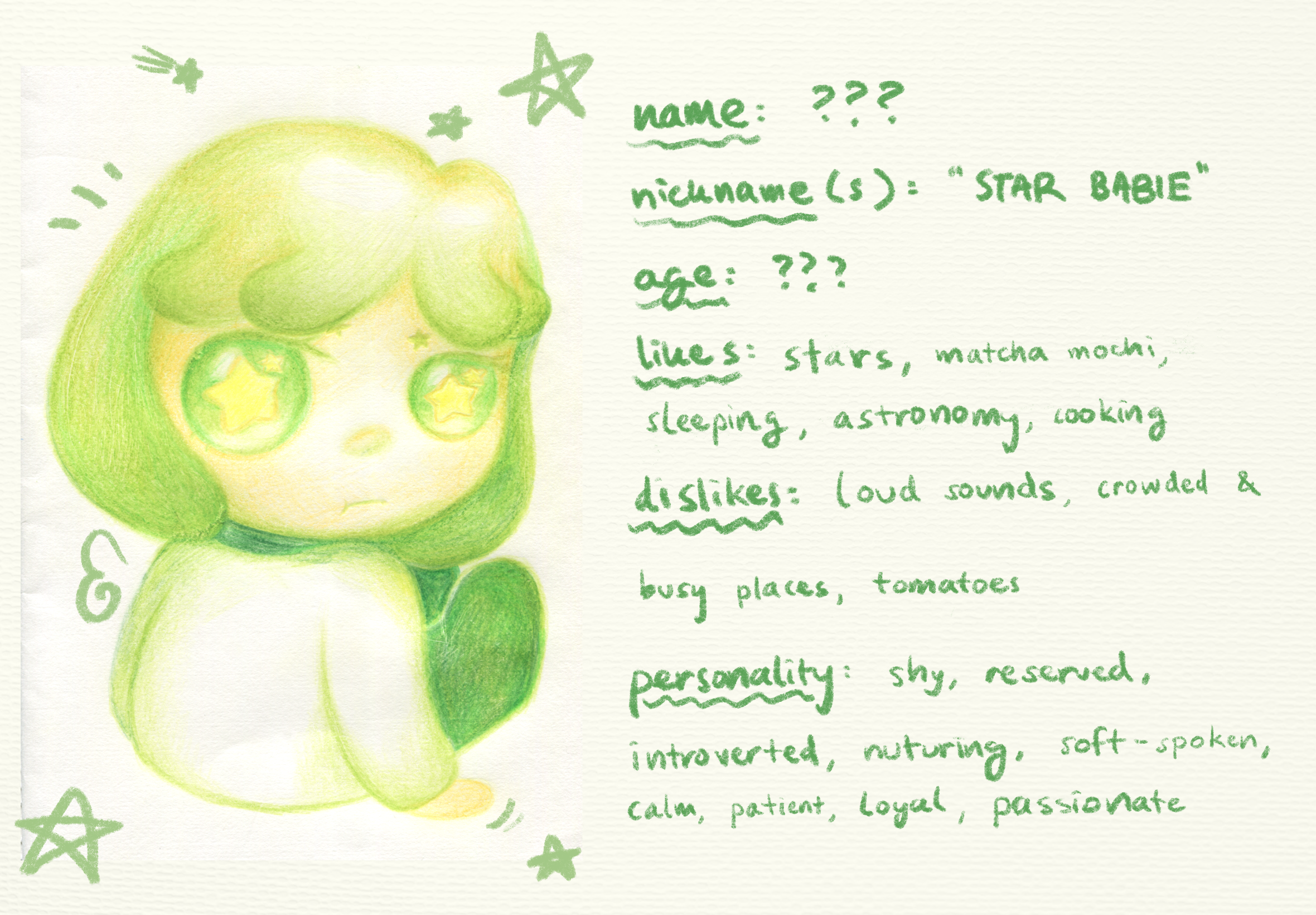
the development of starry babie did involve small amounts of self-insertion, as aspects of the character reflect my own identity, personality, and characteristics. it symbolizes who i was as a person during my time at university.
the development of starry babie did involve small amounts of self-insertion, as aspects of the character reflect my own identity, personality, and characteristics. it symbolizes who i was as a person during my time at university.
meet starry babie!
digital scan, color pencil on paper
digital manipulation in Procreate
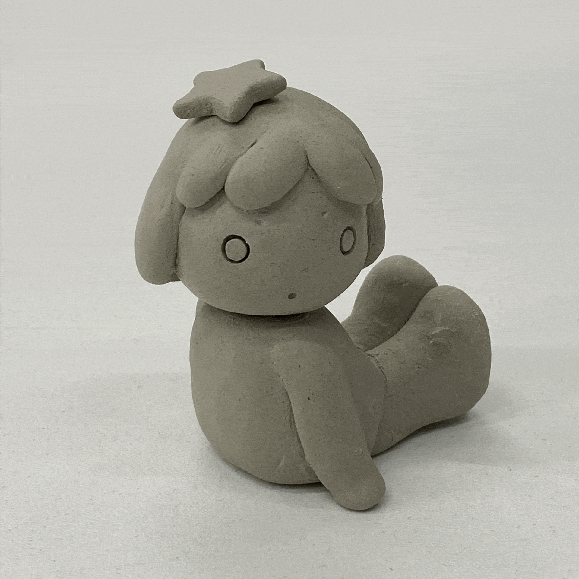
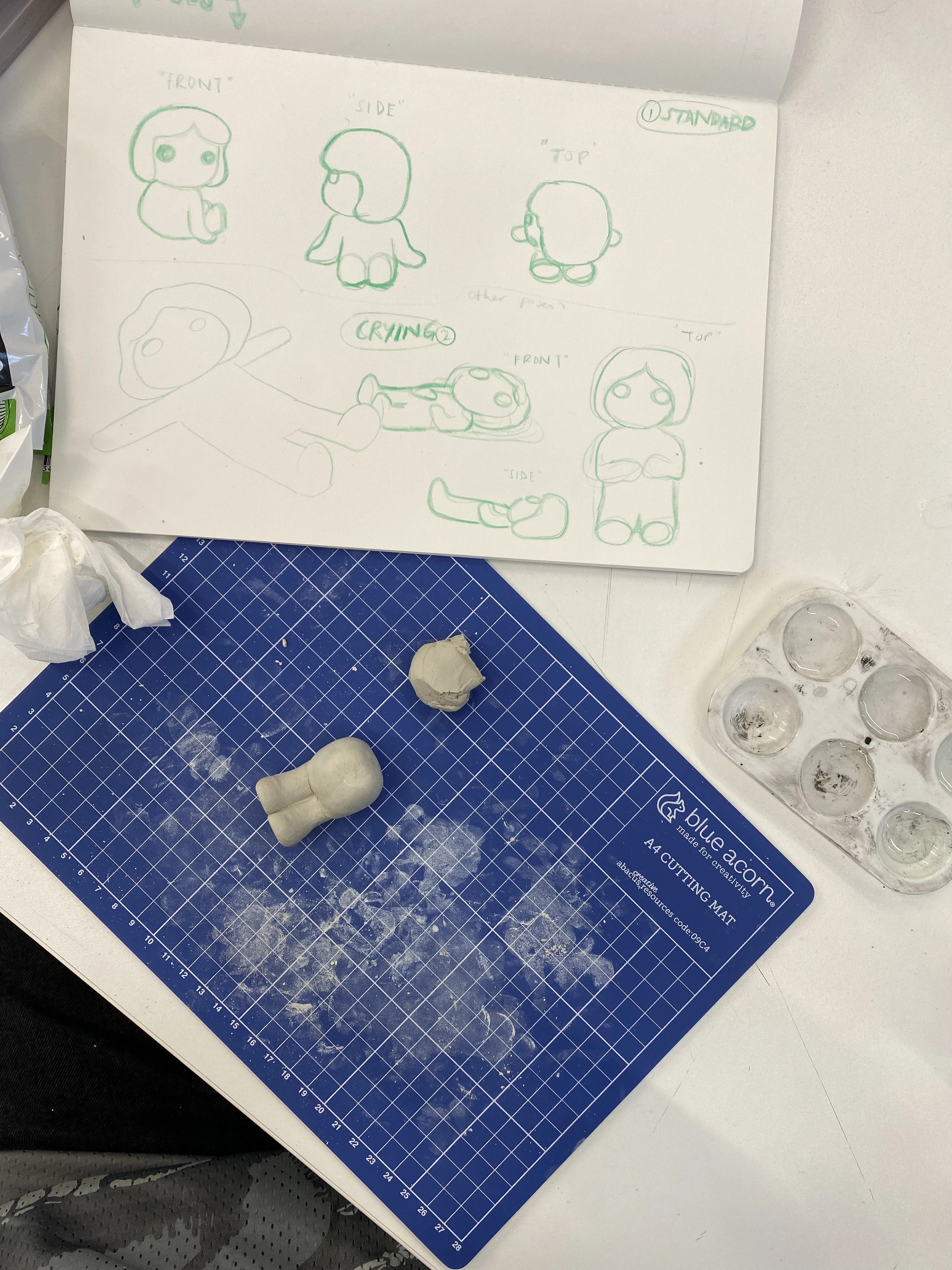
airdry clay
untitled sketches
digital scans, highlighter marker and color pencil on paper

.png)
.png)